
Painting Wolverine
Ever wonder how one of these is done? It is more complicated than you may think. To make one of these little figures look as they would be full size, a variety of painting techniques are used to get it looking just right. Follow the steps below as I paint the Wolverine miniature from the Marvel United board bame.
01
Right out of the box
These are actually pretty high-quality and detailed miniatures, which is a huge plus at the beginning. It is molded plastic and each is about an inch high. They are actually a bit bigger than a D & D miniature, which has pros and cons. Not as many tiny areas to paint, but shows mistakes more because it is bigger.

02
Inspiration
Wolverine has had so many costumes over the years, it is difficult to choose how to paint him. I am a bit of a purist, so I am going with the color scheme that is on all the cards in the game itself. In this art, his trunks, boots, and gloves are darker than in, say, the '90's era X-Men animated series. I kind of like that, so lets stick with that palatte.


03
Getting the miniature ready
For Wolverine, he is a blue molded plastic. Sometimes there is a little bit of a mold release film on the plastic from the manufacturer. A quick wash in soapy water helps, but I spray with a simple gray primer to really get that surface ready for paint. Use only a very thin layer of primer or you may lose some of that lovely detail on the miniature.
04
Mounting
I have this nice little tool that I mount the miniatures on when I paint. It is basically a plastic handle with a supply of sticky tack to affix the mini to the top. I used to try to hold the mini by the base while I painted, but this is much more comfortable.


05
Base Coat, Part 1
Painting miniatures involves laying down many, thin coats of paint that are gradually built up to account for shadows, base colors, and highlights. Here, I have laid down a dark yellow over the majority of his costume as well as a blend of his flesh tone and brown to the areas of exposed skin. These colors will account for the shadows when the main colors are applied.
You can also see I painted the eyes and teeth right off the bat. This is a much better approach than trying to apply tiny bits of white in already painted areas and hoping not to smudge. You'll see why in future steps.
06
Base Coat, Part 2
Next was the dark base coat. Since the rest of the costume will be a very dark blue, I used black as the base. In retrospect, I should have blended dark blue and black for the trunks, gloves, and boots, but I can fix that with the layers of the main colors.
You will also see here that I cleaned up the eyes and mouth. Simply put, painting a bigger area is easier than painting a smaller one. So by doing the eyes and mouth first, and then painting the larger areas around them, saved a lot of heartache moving forward.


07
Shadows
It was time to start some layering, but first, I needed to add some of the deepest shadows, mainly to his abs, back muscles, and arms. For this, I used an ink wash.
Ink wash is an alcohol-based pigment that flows into the deepest cracks of the mini and then dries, leaving the color. You can see I did this in these two pictures. They came out quite dark, but I can clean that up in the next steps.
08
Layering, Part 1
The time has come to lay down the "main" colors using a technique called layering. Multiple, watered-down layers of paint are applied, gradually building up the color that you need. This is done to make a gradient of one color to another and to reduce the visibility of brush strokes.
Here, I combined the dark yellow of the base coat and the yellow of the costume to begin to create that gradient. You can already see the results in the space between his pectoral muscles. That isn't shadow; that is the effect of layering to create depth.


This is an excellent video demonstrating the layering technique. Remember, this guy is a master, and he makes it look easy. But it really demonstrates what we are trying to achieve.
09

Layering, Part 2
After the first layer was put down, it was time for the actual yellow of the costume. This was applied, but I left space at the edges of the areas for the previous dark yellow/yellow mix to be visible. This creates the illusion of depth with a subtle gradient.
I also applied the first layer of the dark blue/black mix that went on the gloves, boots, trunks, and shoulders. Hopefully, the pictures captured the depth that I am trying to create.
10
Layering, Part 3
Once I got the layers of the costume yellow built up to where I wanted, it was time for the blue of the shoulders, gloves, boots, and trunks.
I didn't put quite as many layers of this blue on. I wanted this color to remain a little darker to break up the brightness of the yellow


11
Highlighting


Highlights are the opposite of the shadows. In this step, you place even brighter versions of your colors on the highest "points" of the miniature, to further enhance that 3D effect.
Highlighting is not my strength, and I don't often like how it looks even if I do it well. I kept my highlighting fairly subdued in Wolvie's case, but you would see it most on the knee, pectorals, and top of the head.
With the layering now done, look again at his chest between his pectoral mescles. Again, that is all paint layers and gradients, but it gives the illusion of depth, which is exactly what we want.
12
Final Details
It was now time for the clean-up work. First I had to finish that red belt (no, I don't know why they made it red). That itself needed a bit of layering, the buckle needed to be painted, and the holes in the belt needed an ink wash to fill them in. In addition, his claws needed to be done as well.
Wolverine is a hairy guy, and the sculpt has some exposed hair just above the gloves. At this scale, sculpting individual hairs looks bad, especially when you paint them black. In the end, I painted the flesh tone back over them. They did not look right!


13

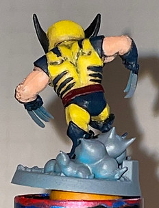
Not Done Yet!
The elephant in the room here is that base. All of the Marvel United figures have a nicely detailed base. However, this one has me stumped.
What the heck is Wolverine standing on? I think it is supposed to be dust or an explosion or something. It LOOKS like meringue from lemon meringue pie. I going out a limb and saying that isn't what it is supposed to be, but I'm going to have to think on this for a bit.
What do YOU think it is?
14
The Base
I decided to paint those odd "puffs" to look like clouds of dust. This tested my skills at painting a gradient, with a mid-brown to a bone white for the tips. The rest of the base got some brown, gray, and metallic steel for the dirt and stone parts. A simple wash will bring out those details for a nice finish.


15
Finished!
Overall, I'm happy with how this came out. Some of my lines aren't as clean as I would like but in all, I think this is a nice addition to my collection of Marvel United pieces. I've had a request to do Black Widow next, which has been the mini I've been avoiding since I got the set. Come back to find out why and how I overcome the obstacles she presents.
